It’s a new year, and EagleView has a whole new look. Here’s everything you need to know about this long-awaited update.
Why the change?
Simply put, it was about time our brand identity caught up to the incredible advances we are making across the board as we evolve as a technology company. As EagleView continues to drive innovation, we need to cultivate an identity that supports our mission. The new EagleView brand is fresh, modern, and designed to embody the innovation we drive from earth to sky.
What inspired the design?
First, the team worked with experts to develop a new logo and brand aesthetic that would reflect who we are and what we do. We then applied a design principle universally associated with beauty and balance, the Fibonacci Sequence or Golden Ratio, to develop the logo.
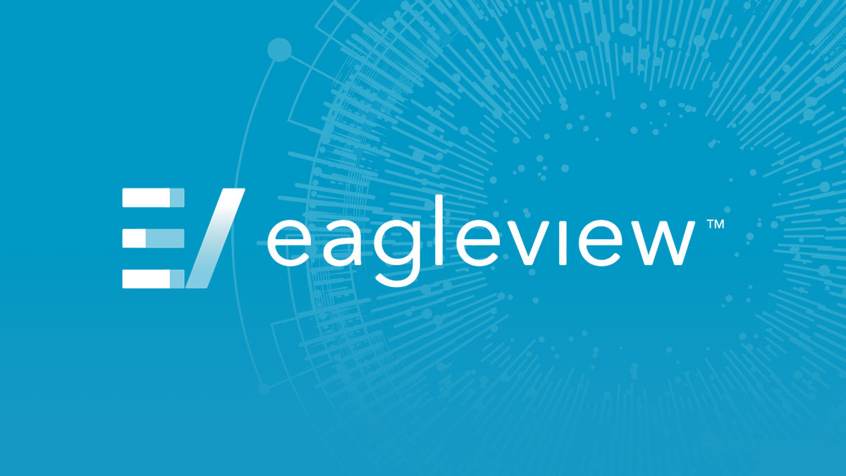
Lastly, we drew inspiration from what we do and where we do it. The colored bars in the “E” allude to data bars, as we continue to grow as a property and data analytics company. We selected blue to represent the company’s analytical strength and green for the human spirit we celebrate in our employees. The green fading to blue calls out the earth, where we serve our customers, and the sky, from where we capture our imagery.
What else can we expect with the rebrand?
First and foremost, you should not see any interruptions to service as the result of the rebrand. You will, however, see updates featuring the new branding in platforms like the EagleView App and CONNECTExplorer. Additionally, the website has been updated to reflect the new brand identity.
I have additional questions about the rebrand. Whom can I contact?
Please contact your EagleView rep if you have any questions about the rebrand. You can also reach us using the information on our Contact page.
Here’s to a whole new chapter in EagleView history. We’re thrilled that we get to share it with you!
Read a message from our CEO Rishi Daga about how we take our customers from imagery to outcomes.
Press Inquiries
For media opportunities and other related press inquiries, please email
 It’s a new year, and EagleView has a whole new look. Here’s everything you need to know about this long-awaited update.

 Lastly, we drew inspiration from what we do and where we do it. The colored bars in the “E” allude to data bars, as we continue to grow as a property and data analytics company. We selected blue to represent the company’s analytical strength and green for the human spirit we celebrate in our employees. The green fading to blue calls out the earth, where we serve our customers, and the sky, from where we capture our imagery.